

Redesigned Website, Illustration, and Icon
JustCo is co-working and event space base in Singapore. JustCo’s mission is to enable anyone to have the best work/life experience anywhere anytime. We pave the way for the future of work via platforms that are powered by technology. They make work better by revolutionising how people work, empowering our ever-growing community with exceptional flexibility, opportunities and experiences.
In terms of JustCo website, it’s old website has several usability issues and layout is not the simple. The site was redesigned to resolve, create new illustrations, and icon such the problems as well as to align with JustCo brand identity.
Go to the website -> Justcoglobal.com
The website should be simple and not be create confuse to users.
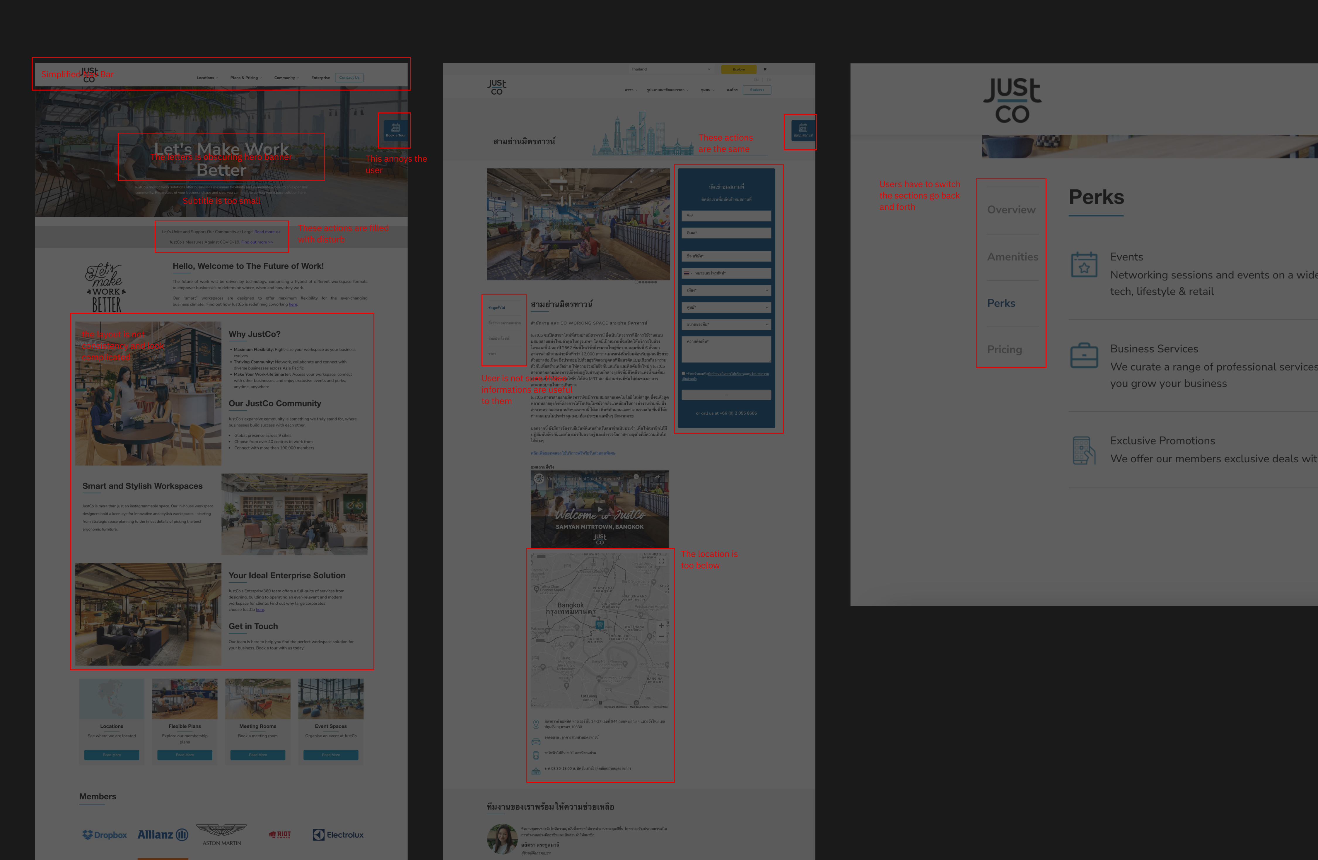
The website forms usability are too similar and users do hard to separate


Clients should be easy to search the location of a co-working space within the first view when they go to a landing page so we lifted it up to first position on the landing page. Including a layout is clearing up to easy to separate each section

Lifting location up to top can help users easy to consider and decide on rent a space


Our brand identitu applies to the icons set as well. Every icon is built on a grid, and every stroke obeys strict principles


Used the isometric graphic to represent JustCo's product and ensures each illustration is tied back to JustCo workspace visual language.

